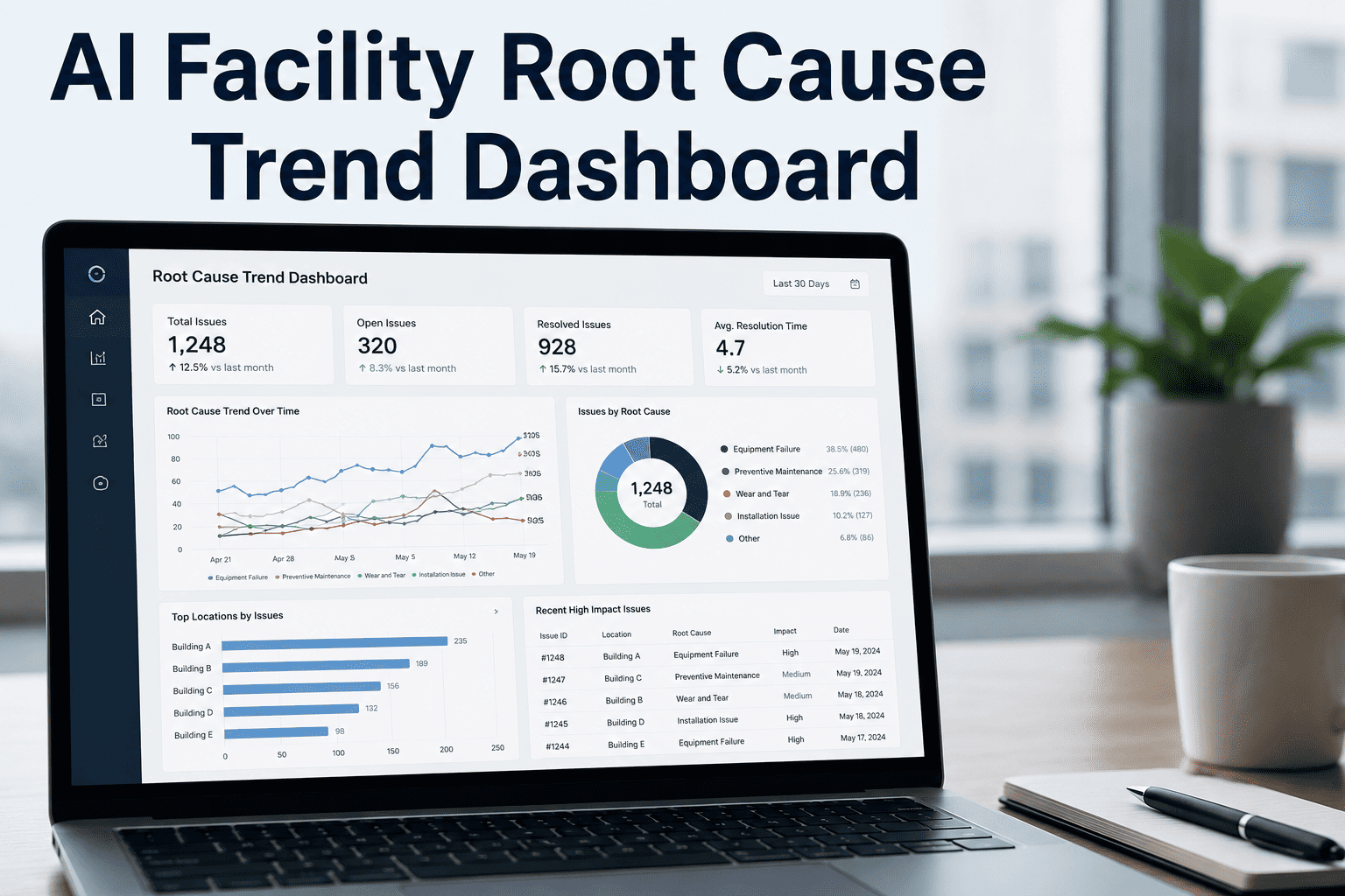
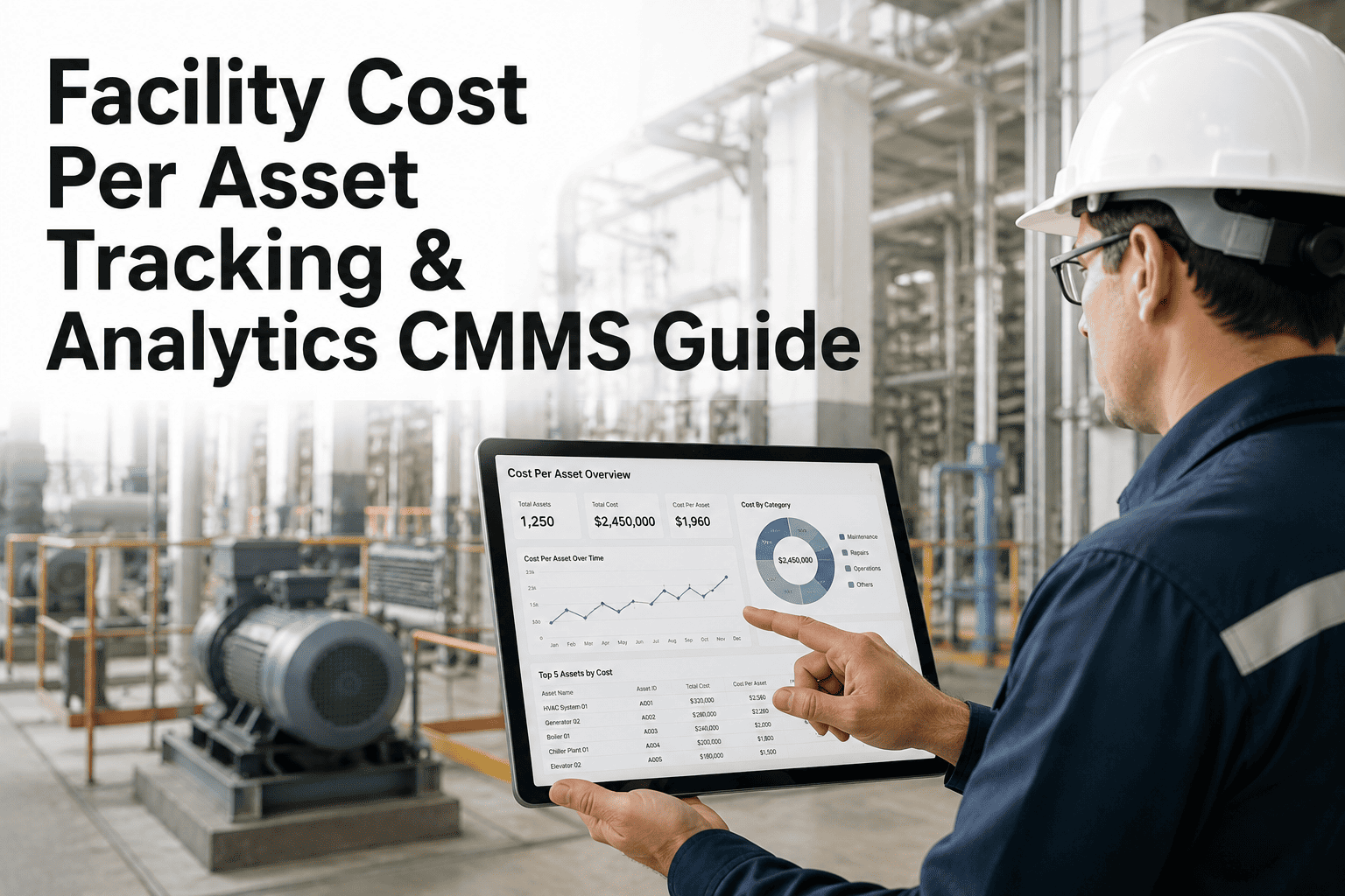
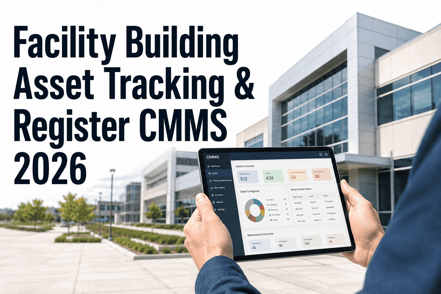
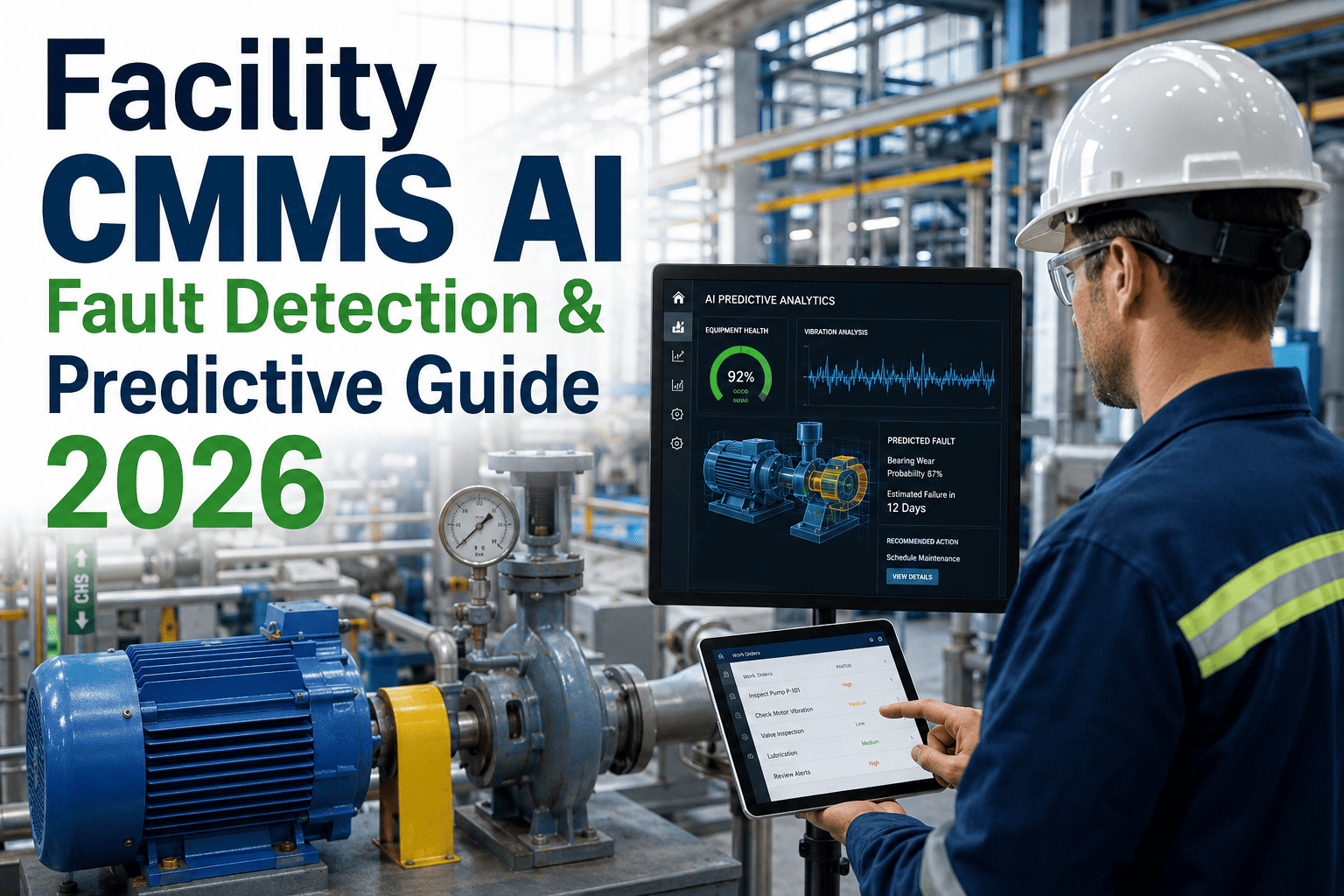
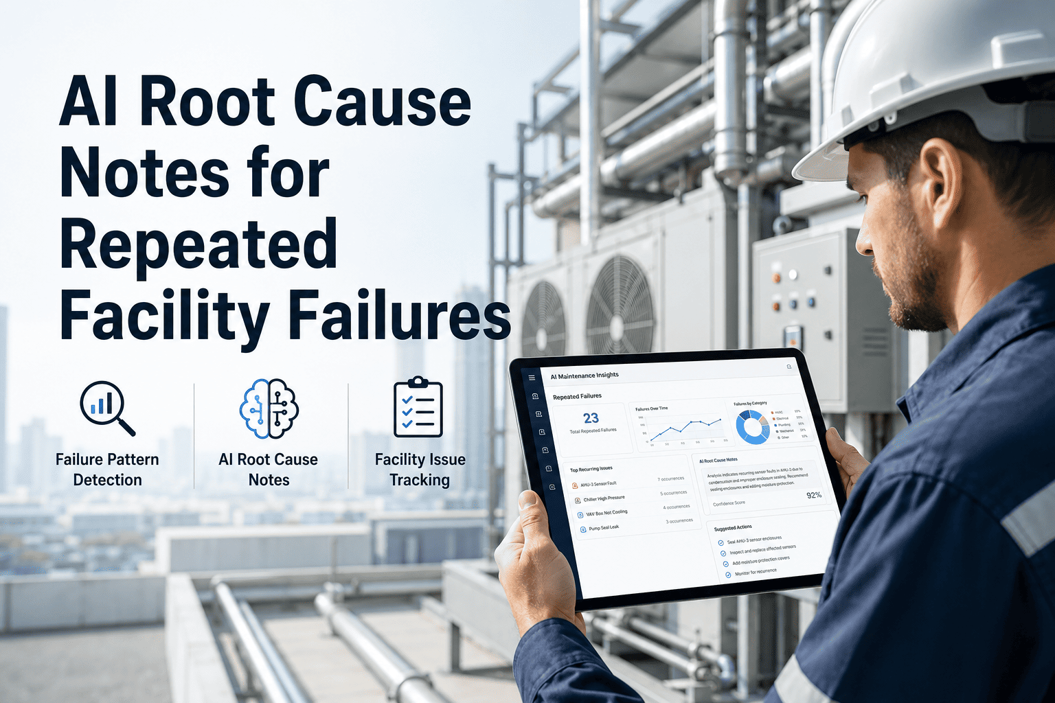
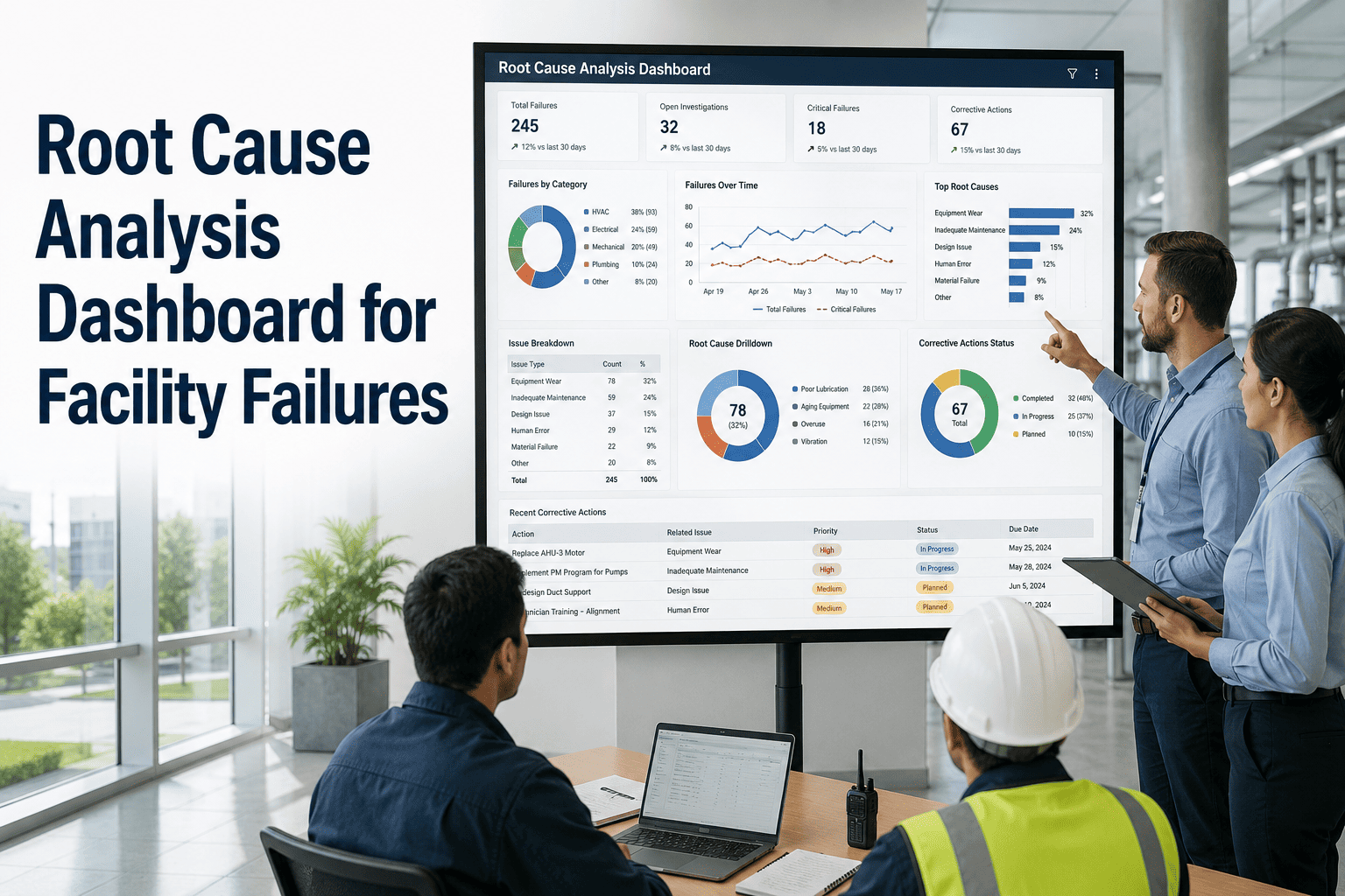
Every facility accumulates maintenance data — but most of it is never analyzed. Work orders close, costs get recorded, and assets fail again six months later. The pattern was always there; the visibility was not. AI root cause trend dashboards change this by continuously scanning your historical work order data and presenting failure trends, repeat root causes, and asset trajectory curves in a visual format that requires no analyst to interpret. Facility directors using root cause dashboards reduce chronic equipment failures by 30–45% within one operating year and shift their maintenance spend from reactive to planned by an average of 22 percentage points. Start free on Oxmaint and surface the root cause trends hiding in your maintenance history today.
AI Analytics · Root Cause Analysis · Facility Intelligence
AI Facility Root Cause Trend Dashboard
Your maintenance data is already telling you which assets will fail next, which locations are deteriorating, and which repair codes keep repeating. The AI root cause dashboard makes those patterns visible — in real time.
▲
Bearing Failures — Pump Assets
+340% in 60 days
Root cause: Lubrication gap in PM schedule
⇄
Electrical Tripping — West Wing
Recurring since Q2
Root cause: Panel overload, 3 circuits affected
▼
HVAC Filter Failures — Floor 2
Down 62% after fix
Root cause resolved: PM interval shortened
What the Dashboard Tracks and Visualizes
The Oxmaint root cause dashboard operates across six analysis layers, each surfacing a different category of failure intelligence.
1
Recurring Failure Code Trends
Tracks which repair codes appear most frequently across your asset fleet and flags codes that are increasing month-over-month — early warning of a systemic issue before failure frequency becomes critical.
2
Asset Failure Trajectory Curves
Plots each asset's repair frequency over time. An accelerating curve — 1 failure/quarter becoming 1 failure/month — is a reliable signal for replacement planning months before the crisis point.
3
Location-Based Failure Hot Spots
Maps repair activity to building zones. Persistent hot spots reveal infrastructure problems — aging wiring, drainage issues, humidity zones — that affect multiple assets and systems simultaneously.
4
Complaint-to-Failure Correlation
Links occupant complaint patterns to subsequent asset failures. Facilities can identify which complaint types reliably precede specific equipment failures and create complaint-triggered inspection workflows.
5
PM Compliance vs. Failure Rate
Correlates missed preventive maintenance with subsequent reactive repairs on the same asset. This correlation is the clearest ROI argument for PM investment — and the dashboard makes it visible in one view.
6
Seasonal and Temporal Patterns
Identifies failure patterns tied to seasons, weather events, or building usage cycles. Pre-season PM calendars can be built directly from historical temporal failure data — eliminating predictable reactive spend.
Root Cause Categories and Action Mapping
| Root Cause Category |
AI Detection Signal |
Recommended Action |
Expected Outcome |
| PM Interval Mismatch |
Failures consistently occur before next scheduled PM |
Shorten PM interval; add condition-monitoring step |
30–50% reduction in reactive failures on asset |
| Parts Quality / Spec Issue |
Same component failing across multiple assets |
Parts specification review; alternate vendor evaluation |
Eliminates cross-asset recurrence |
| Installation / Commissioning Error |
New asset fails within 90 days repeatedly |
Commissioning checklist audit; contractor review |
Eliminates infant mortality failures on new installs |
| Environmental / Operational Stress |
Same asset class fails in one location, not others |
Environmental assessment (humidity, heat, vibration) |
Source elimination; extends asset life 20–35% |
| End-of-Life Asset Trajectory |
Failure frequency accelerating over 6–12 months |
Capital replacement planning; budget justification |
Avoids catastrophic failure; planned replacement |
See Your Facility's Hidden Failure Trends in One Dashboard
Oxmaint's root cause dashboard connects your work order history, complaint data, and PM records into a single visual intelligence layer — no analyst required.
Expert Review
RC
Reliability Engineering Expert
Asset Trend Analysis Review
Root cause trend dashboards represent the evolution from maintenance management to maintenance intelligence. The fundamental challenge in facility management has never been a lack of data — it has always been a lack of analytical capacity to make sense of it. A senior facilities manager reviewing 3,000 work orders per year manually cannot realistically identify that bearing failures are accelerating on one asset class while cooling coil failures are trending down after a PM change. AI does this analysis continuously and presents the conclusions visually. The operational impact is a shift from identifying root causes after the fact to anticipating them before the failure occurs — which is the definition of a proactive maintenance program. Facilities achieving this transition typically reduce total maintenance costs by 18–25% over 24 months.
Frequently Asked Questions
How much historical data does the AI need to generate meaningful root cause trends?
Oxmaint generates initial trend insights with as little as 90 days of work order history, though 12 months of data produces significantly richer analysis — especially for seasonal patterns and long-cycle asset failure trajectories. Most facilities with an existing CMMS can import historical data on day one, accelerating the time to first insight.
Start free on Oxmaint and import your historical data for immediate trend analysis.
Can the root cause dashboard be used for executive-level reporting?
Yes — Oxmaint's root cause dashboard includes an executive summary view that distills trends into plain-language summaries suitable for leadership presentations and board-level briefings. The summary view shows top failure trends, PM compliance impact, and projected cost avoidance from identified root causes — in a format that requires no maintenance expertise to interpret.
Book a demo to see the executive dashboard view.
Does the dashboard update in real time or on a scheduled basis?
Trend data in Oxmaint refreshes continuously as new work orders are created, updated, and closed. Trend alerts — such as a sudden acceleration in failure frequency on a specific asset — trigger notifications in real time rather than waiting for a scheduled report run. This ensures managers see emerging patterns within hours, not weeks.
Book a demo to see the real-time trend alert system.
Can root cause trends be used to justify changes to PM schedules or capital budgets?
This is one of the most powerful applications of the dashboard. Oxmaint generates exportable root cause reports that tie specific failure trends to PM compliance data or asset age — providing the evidence needed to justify schedule changes to maintenance leadership or capital replacement requests to finance teams.
Try Oxmaint free and generate your first root cause report for capital justification.
Stop Letting Failure Patterns Repeat Undetected
Oxmaint's AI root cause trend dashboard turns your maintenance history into predictive intelligence — revealing the patterns behind chronic failures before they cost you again.